Deanne Cheuk had no idea what graphic design was until she enrolled in a Bachelor of Arts at Curtin in 1992 and was told by her teacher that it could lead to a career in designing toothpaste cartons. She has since made a career that is outside any box as a New York-based art director, illustrator and artist, and has been commissioned by global companies including American Express, Levi’s, Lane Crawford, Microsoft, Dell, Nike, Target and Olay.
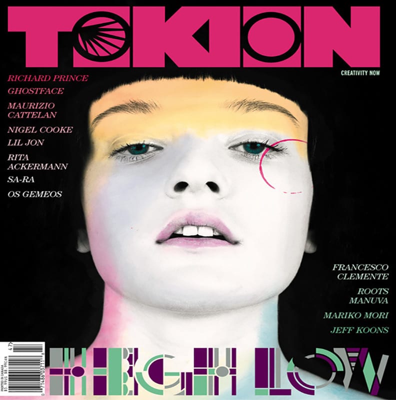
Cheuk has also contributed her designs and artistic direction to multiple publications such as The Guardian, Dazed and Confused, Nippon Vogue, Nylon and The New York Times. She is renowned for her illustrative typography, particularly in Tokion magazine, and was art director of 21 of its issues. In 2005, she released her first illustrative book, Mushroom Girls Virus, which sold out within hours and features the world’s first fully embroidered linen cloth cover.
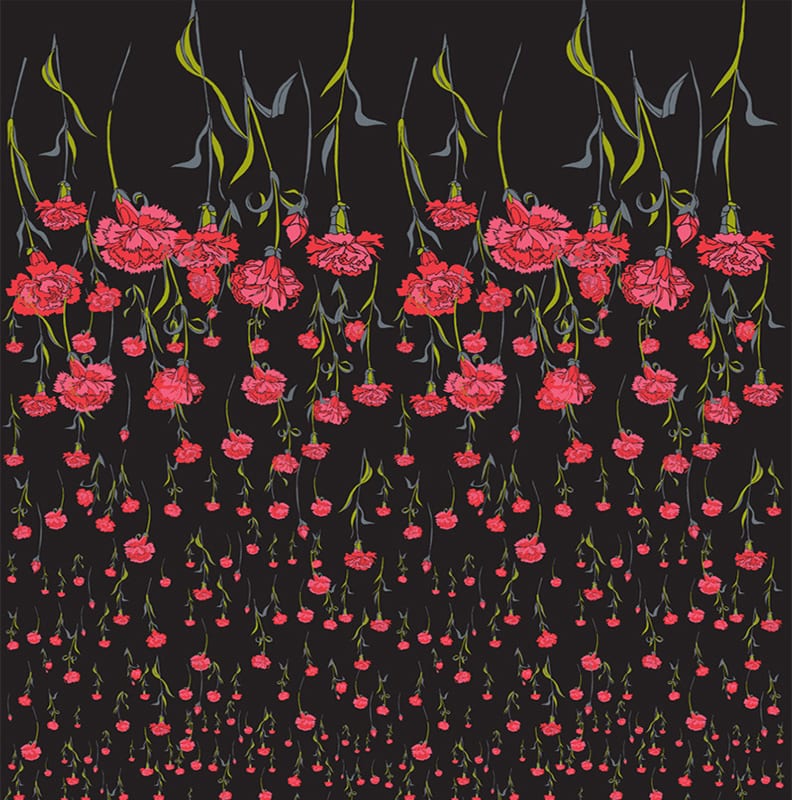
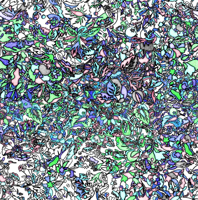
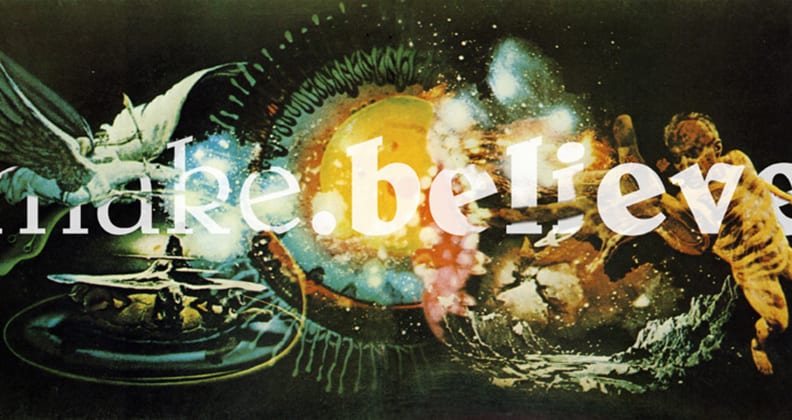
Her style could be described as a divine kaleidoscope of colour and forms, with subjects that are at once whimsical and haunting, ethereal and earthly.
Cheuk spent a New York minute to tell us at Curtin about her recent forays in the design world.
Q. You have an incredibly broad portfolio of work, clients and work experience – what keeps you so driven and motivated?
A. Each project that comes my way is usually very different to the last, so it keeps me interested to be working on different things. For example, at the moment I have just finished a new line of perfume packaging, a fashion catalogue, some advertisements for Snapchat and a few invitations, and I’m casting for a shoot next month. I’ve always loved working; when I stop enjoying it then the drive will go away. Coming up with new ideas is the fun part!
Q. You’ve been in New York for some time now, but do you feel your experience in Perth continues to influence your work in any way?
A. I’ve been in New York for 17 years now and have worked for many different brands and companies – I do believe that I have a strong ‘do-it-yourself’ ethic that comes from how I was trained and the companies I worked for while I was in Perth; it really instilled in me the sense of independence that I have towards creating my own projects. I enjoy working with a team but also enjoy taking on everything that I can handle.
Q. What’s the best thing about living in New York?
A. New York is a melting pot of creativity, culture and excitement, there is always so much going on, it’s hard to keep up. Music, art, fashion, design, culture, young and old – there is always something for everyone. Nothing compares to Perth though!
Q. Where do you get your inspiration and ideas from?
A. Most of my inspiration comes from art, films and people on the street.
Q. What’s the most creatively rewarding project you’ve been involved with, and why?
A. I don’t think it’s possible to pick just one project! I would like to believe that I learn something new from all of my projects, but one that always stands out is a zine I published many years ago called Neomu. It was billed as ‘the world’s smallest magazine’ – it had no words and was just images, art and illustrations. It came out of a frustration with expensive books that weren’t amazing on every page – I wanted to produce something that was inspiring on every page, and I had assumed that if the size was very small, then it would be cheaper to produce (which it wasn’t) and that was how it started.
I published eight issues and had always wanted to do 10, but so far, it’s still at eight. I sent it to stores for free and they donated the proceeds to a charity of their choice. The idea was to pass on inspiration. I had the token price of $1 on the cover, and when the first issue was being printed, my printer called me to ask if the price was a typo as it was costing $4 to print each copy! But it was incredibly rewarding for me to meet and work with so many young designers, who I remain friends with today.
Q. Are there any design trends that have come and gone that you’re glad to see the back of?
A. Uncoated paperstock reminds me of 1999 when I used it in my first issue of MU. I still have a hard time using it for any new projects!
Q. What’s one piece of worldly advice you’d give to Curtin design students or new grads?
A. Just be true to yourself and your own vision. My work looked different to everyone else’s when I was at Curtin because I wasn’t trying to mimic anyone else. Having said that, I went to Curtin with so many talented students – Aneta Wnek, Sinead Hanley, Stuart Medley, Toby Gibson to name a few – we all had our own aesthetic.
Q. Finally, what’s something you haven’t done yet, but would like to still achieve?
A. I want to have more shows of my artwork, but I’m still building up a body of new work of charcoal on paper. I’d love to have a show in Perth eventually!
Follow Deanne Cheuk on Instagram @mrdeannecheuk to stay-up-to-date with her latest work.
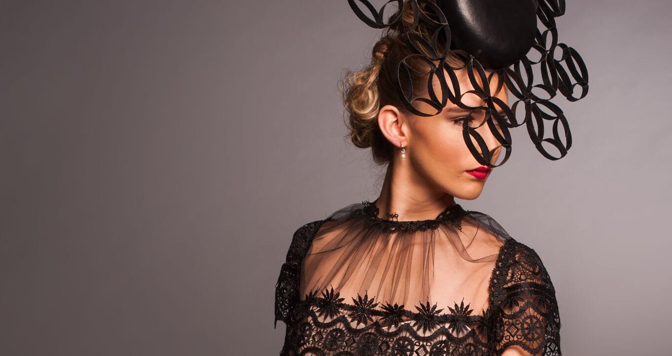
All images in this article were sourced with permission from Deanne Cheuk from her website and her artist profile on Hugo&Marie.