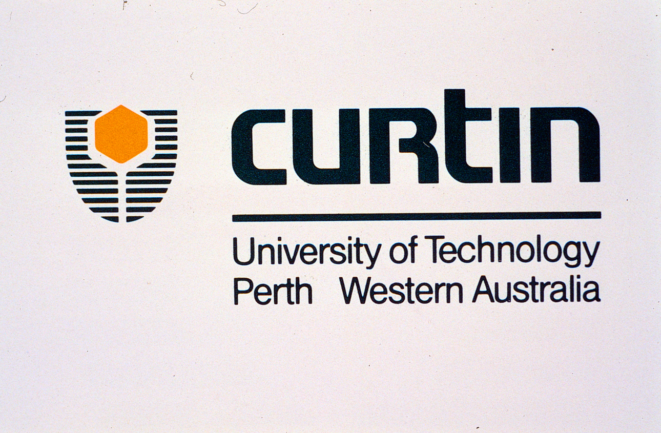
Curtin University’s logo still carries with it a connection to our days as the Western Australian institute of Technology (WAIT) and the symbol we used then.
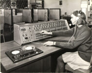
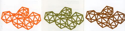
The original WAIT design was developed in 1967 by David Walker, a WAIT art and design teaching staff member:
“The symbol represented the cross-disciplinary nature of the new Institute, its technology focus and the evolving and changing nature of tertiary education,” said David Walker. “Although fairly abstract, the symbol provided a visual essence of an Institute of Technology. There were to be no rampant swans entwined with kangaroo paws.”
Source: WAIT Gazette, July 1968
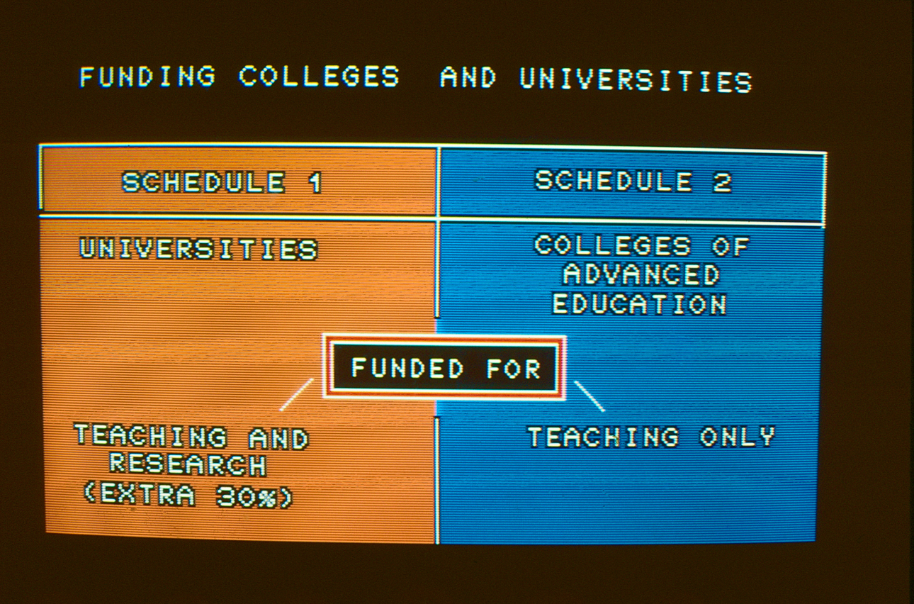
In 1986 work progressed on changing the status of WAIT to that of a university. A number of reasons were behind this change. At this time WAIT was generating research outcomes commensurate with university level standards or results. However, as a College of Advanced Education there was no recurrent government funding to support WAIT research. As seen by the slide below, elevation to university status would unlock access to increased Commonwealth funding.
Source: Director Don Watts letter to staff, June 1986.
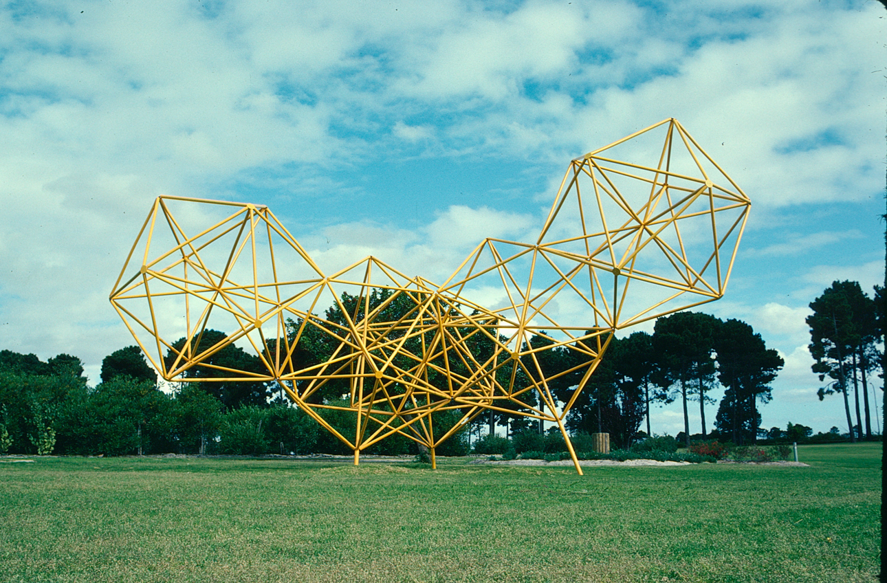
During 1986 and in preparation for our change in status, we began developing a new symbol and logo design. One of the first ideas was a shield in the shape of a star. In a lengthy discussion at its 1986 November meeting, the WAIT Council resolved there should be more connection to the WAIT symbol. The proposed star shape was replaced with a device that referenced the original WAIT tetrahedron design. Council saw retaining elements of the WAIT symbol as an integral element of the new design.
Moving on from the WAIT symbol was also described by the WAIT sub-committee tasked with the design work, as a practical solution to technical problems with reproducing and printing the three-dimensional shape in a flat two-dimensional format (i.e. on business cards).
The new 1987 Curtin University of Technology corporate style manual described how the new design would denote our new university status through a shield design. This would be in keeping with the form adopted by other universities, yet maintain our connection to our history as:
- the two halves of the shield were derived from the WAIT symbol; and
- the technological shape provided connection with our former structure.

In 2010, we became Curtin University, removing the words “of technology” in our name.